Friday, 15 October 2010
Treatment - Liquid Lives
Monday, 11 October 2010
Product Research - Jennifer's Body Teaser Trailer and Poster
- 20th Century Fox comes up at the beginning showing the importance of the institution and that the film is mainstream.


- Music starts off quieter but when the action is introduced it becomes more dominant
- The lyrics of the song hint at the plot of the film.
- At the end the music cuts out to have some dialogue. The dialogue hints at the plot of the film and is sexually suggestive intriguing the audience.
- Titles slates are used to suggets the film's plot rather than a voiceover.

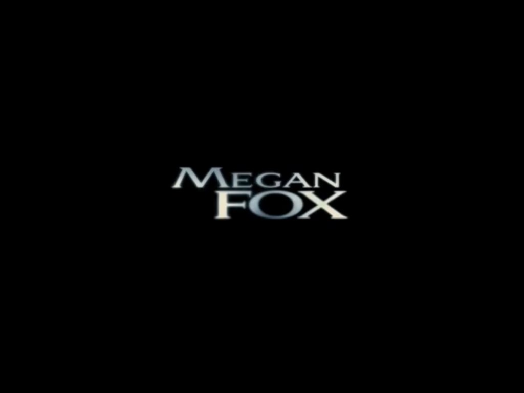
- It is made clear who the film's main character is as shots are mainly of Jennifer (Megan Fox) and the actress is the first to be credited

 .
. - The release date is made clear
- Just before the name of the film comes up there is an abrupt end to the music keeping the audience intrigued.
- The rating comes up at the end of the trailer telling the audience it is meant for older teeenagers.


- uses dark colours to show the nature of the film
- however also shows a hand sticking out of the desk to suggest comedy aspects
- she is wearing a short skirt and red clothing which suggests she is both a seductress and dangerous
- there is no release date
- the text is different to the font in the teaser trailer showing that there does not always have to be continuity across all the promotional products.
Product Research - The Runaways Teaser Trailer and Posters
- Use of voiceover conforms to conventions of a teaser trailer. Informs the audience of general plot of film.
- Use of dialogue is sparse. Used again to hint at the plot whilst keeping the key factors hidden.
- Music becomes heavier as the action of the trailer becomes more intense, highlighting this fact and separating the trailer intop distinct parts.
- This is also show by the flashing lights which again introduces the action.

- The institutions are shown in red which is unusual. These colours are often associated with rock music and rebelling, a clear theme within the film.

 Main characters are introduced, intriguing the audience.

- Actress names come up on a red background and and have the images actors red-washed, keeping the colour scheme which creates continuity within the trailer. This also attracts fans of the actresses

- 'In theaters Spring 2010' is a non-specific release date which keeps the audience interested.
- There is also a website which encourages the audience to look into the film more and leaves it open for viral marketing.


Product Research - St Trinian's Teaser Trailer


Friday, 8 October 2010
Audience Research
 I found out that my audience were approximately 20% male and 80% female so this is the demographic I am going to aim my film at.
I am aiming my film at the age range of 15-20 year olds, meaning the highest classification it can have is a 15. Most of the people who responded to my questionnaire were either 17 or 18 years old so although I will be focusing on the wide range of 15-20 I will be focusing more on the specific ages of 17 and 18.
Next I needed to find out the psychographics of my audience. Although I had decided previously that I am going to make a teaser trailer for a teen drama, I asked my audience their favourite genre to see if I could create a hybrid. The majority of my audience said they preferred the genre of comedy so I will try to incorporate aspects of comedy in my trailer.
 I then asked my audience what makes them want to see a film, nearly half said the teaser trailer is the most important, followed by film posters and stars. Obviously, I cannot have big names in my film, so I will focus mostly on the teaser trailer, then the film poster, followed by the magazine cover.
 Most of my audience like a poster to be predominantly images, none chose the option of predominantly text. They also like vibrant colours. I will use mostly images and try to use vibrant colours when creating my film poster. as it will then be more likely to appeal to my audience.
Most of my audience do not read film magazines.
 I asked them what magazines they like to read if they do not read film magazines. The most popular was music magazines so for my magazine cover I will try to incorporate conventions of a music magazine.
Tuesday, 5 October 2010

Friday, 1 October 2010

Thursday, 23 September 2010
Product Research - 127 Hours Teaser Trailer
- The trailer opens with the institutions of the film such as Fox Searchlight, however much more time is spent focusing on the director, Danny Boyle, showing he is well established and this is what will draw the audience in.
- It has a vague release date of 'This Fall' which is conventional for teaser trailers as they designed to make sure the audience have a prolonged interest.
- The phrase 'Takes you on a ride' is a pun as the main character is on a bike at the beginning of the trailer
- Long and wide shots are used to establish the location and show how alone the man is.
- The sign 'Next service 100 miles' also shows how isolated he is from society
- He is normally centre frame showing he is the most important character of the film.
- 'Based on a true story' will intrigue the audience as they all want to find out what happens to this man as he is a real person.
- The camera zooms out showing how far down he is and how deserted the area is. This shows he is unlikely to be saved, leaving the trailer on a cliffhanger and creating a lot of interest amongst the audience.
Monday, 20 September 2010
Product Research - Angus Thongs and Perfect Snogging

- A wide variety of colours are used suggesting the film could have eccentric elements
- The symbol of a lipstick kiss mark is used which is conventional for a RomCom suggesting that it is a RomCom aimed at a younger generation. The shooting stars and clouds used reflect the age of the target audience as they are often associated with pre/early teen girls.
- The main figure of the poster is represented photographically. However, graphics and still images from the film are also used of the poster. This makes the poster more interesting and gives away more of the plot.
- The main messages of the poster are portrayed visually as it is more of a 'fun' film than intellectual.
- The intended audience is pre to early teen girls. We can tell this by the age of the main character and the colours and symbols used in the poster.
- The production values are fairly high as they clearly used computer graphics to create the image cloud.
- At the bottom of the poster it has 'Coming Soon', at the top there is a banner that shows the films that have also been directed by this director.This is important information for the audience.
- Overall I think it is an effective poster as it appeals to target audience and is captivating.
Product Research - St Trinian's Poster

- the primary colour used is pink suggesting the film's main characters are female. However, it is a deep pink which suggests there may be mischief in the film
- symbols such as the skull and crossbones are used suggesting that there is dangerous plotting in the film. There are also dice used which suggests there will be a gamble of sorts in the plot. Finally a school emblem is used to show the setting of the film.
- The main figures of the poster are represented photographically. The girl in the foreground is stood with her chest pushed out and shoulders squared suggesting she is a dominant character.
- the messages are mostly portrayed visually. However, the taglines 'School Can Be A Riot' and 'Expect Disruption' are big hints towards the plot of the film. The title of the film is also in the font of the associated TV programme which widens the target audience.
- The intended audience is probably teenagers which we can tell by the school setting and also the old fans of the franchise.
- the production values are probably moderate as the setting is computerised
- the actors' names are at the top of the poster but there is no other important information.
- While the poster is effective in drawing the audience's attention it does not feature important information such as the release date or classification of the film so it does not effectively do what it is designed to.
Product Research - Kidulthood Poster

- the main colours are dull and dark suggesting that the film will have dark themes in it and that it is a serious film.
- the main characters of the film are portrayed photographically
- The messages in the poster are mainly portrayed through the body language of the characters
- Only the tagline is on the poster 'Before adulthood comes...Kidulthood' this creates intrigue among the audience and also helps to reinforce the age of the target audience.
- the intended audience is older teenagers from the age of 15 upwards. We can tell this from the tagline and the age of the characters. It also has the classification of 15 showing it is inappropriatefor anyone younger.
- the production costs for the poster look low as they are using a real loaction
- it is hard to tell the exact location of the poster but it looks run down and there are tower blocks in the distance suggesting the film is set in a city.
- although the poster does not have a release date on it, it has the rating and a website, two important bits of information for the audience
- as the poster seems low budget it suggests that the film is independent. Also, there is a National Lottery sign at the bottom showing that the film is British and has been funded by the National Lottery.
- I think that the poster is good because it portrays the genre effectively. Also, it appeals to its target audience by use of sartorial codes.